The images presented here are part of ongoing research for visualizations in Digital Humanities. They are premised on a critical engagement with issues in epistemology, as well as being grounded in pragmatic concerns. Digital humanists have made extensive use of visualizations (charts, graphs, diagrams, maps, and timelines) that come from the natural sciences, social sciences, statistics, business applications, and other fields. These bear the hallmarks of positivist approaches to knowledge that limit their application to interpretative practices in the humanities. While practitioners in all of these fields are keenly aware of the ways data production embodies interpretative decisions, and are sophisticated about the statistical complexity and lifecycles of their data (from parameterization to display), the conventions they use in these visualizations remain linked to a representational approach to the display of data.
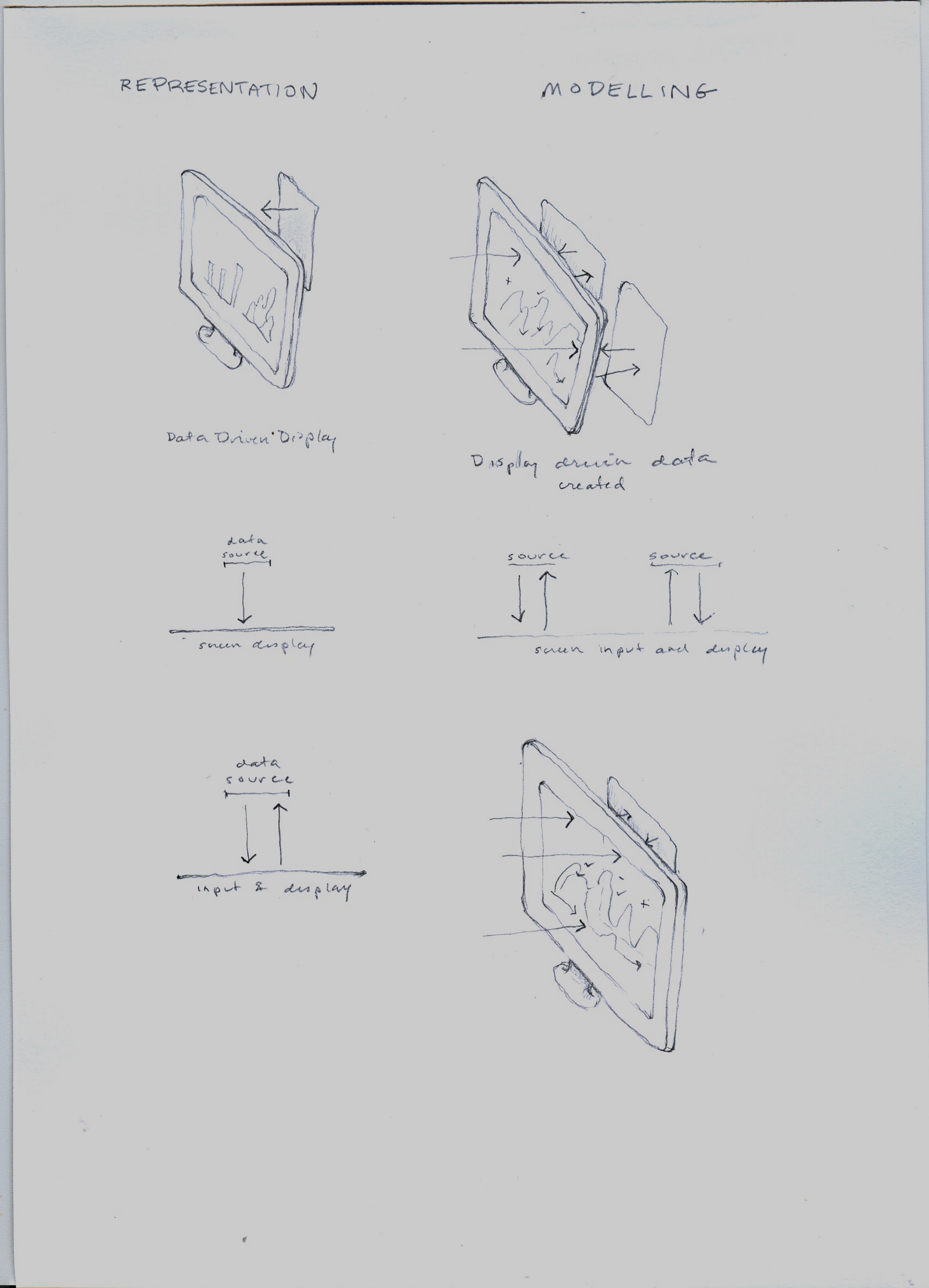
In a representational paradigm, the relation between data and display is uni-directional, the data precedes the display, and the data is presumed to have some reliable representational relation to the phenomena from which it been abstracted. However qualified, the display is a surrogate for the data—which is itself a surrogate, adequate or inadequate, for some phenomena. The display stands for the data, is a re-presentation of the data, and yet, offers itself in the visualization as if it were a presentation, a statement (of fact, or argument, or process). Many visualizations are static, but when they are dynamic, the conventions that have been developed for interactive use are frequently based on an overview and zoom model, which supports faceted search, detailed query, and filtered display.(1) These display methods can be very useful when applied to humanities' projects and research, and I refer to this category of visualizations as discovery tools. Discovery tools use graphical display to see patterns in data, but usually do not put information or interpretation back into the data. The visualization lets you see your data.
By contrast, concept modelling does not assume the existence of data or other representations in advance of the act of modelling. Modelling makes the data, it does not represent data in a chain of surrogates (from parameterization / extraction or abstraction / reduction / standardization / and presentation). A modelling environment consists of concepts that can be activated, moves that can be expressed graphically to model knowledge or interpretation. The graphical elements do not represent a set of entities, but instead, allow intellectual work to be expressed through a process of interpretative action.(2) Concept modelling is based on the assumption that graphical platforms can support interpretation as a primary site of knowledge production and/or interpretation.
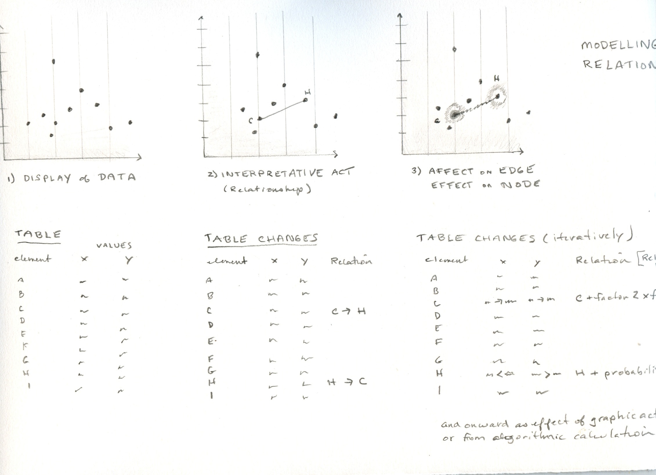
Consider this example: if I have a network diagram on my screen and decide that two of the nodes are related to each other in a particular way, I draw a bold line of connection between them. Connection is an interpretative concept, not an entity; the line connecting the two nodes is an entity, and so are the nodes. The line is used in the service of the concept, and inscribes the interpretative model on the screen. I have used the graphical environment for an interpretative act. The line I have drawn models an interpretation about the information in the visualization. The existence and weight of this line are then registered in a table. The table can hold any attribute expressed as a simple quantitative value or as a an expression of value calcuated as a factor of an affective attribute. This attribute might be static, or change over time, or be calculated to any level of complexity.
Concept modelling is not mechanistic—its displays are not generated solely by an alogorithm with an automated display protocol, but can be authored directly by drawing on a set of graphical activators that inscribe dimensions of interpretation directly in the platform. Representational approaches, by contrast, are mechanistic, because they are not altered once the automatic process of generating a display from a data set is put into play. The lifecycle of data production is concealed in the outcome; the features of the display (proximity, size, scale, color etc.) are often read as semantically meaningful when they are merely the result of display algorithms optimizing screen space; and they present themselves as declarative statements that appear to say: “This is what is.”(3)
Concept modelling is premised on hermeneutic approaches in which each act of interpretation registers directly in the graphical environment and is output to a stored data format (table, database, xml, kml, etc.) from the display space. The visualizations are constructed as models of a particular interpretation, and they bear the signs of their production in author attributes, interpretative layers, other elements that are meant to stress the enunciative aspects of a graphical visualization. In concept modelling, the two-way potential of the screen is activated, and the screen serves as a primary site of work. Interpretation is enacted in the screen environment. The concept modelling environment is designed as a high level set of elements, moves, and dimensional features that can be put at the service of interpretative work. By contrast, representational graphic platforms consist of a specific set of entities and attributes meant to represent data (e.g. timelines consist of points, intervals, dates). The graphical features of the concept modelling environment are designed to express some of the fundamental principles of interpretation: uncertainty, parallax, contradiction, partial knowledge and so on (temporal models are constituted by relations of before and after, simultaneity, duration, slow and fast time spans, and variable models of historical chronology etc.). The concept modelling features are meant to support interpretative work as an active engagement through graphical means. Interpretation is then expressed as data.
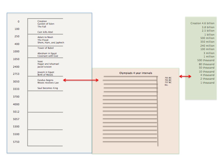
Concept modelling is fundamentally non-representational, in the sense articulated in the practice of critical cartography and non-representational geography. In that context, a map does not precede experience or a phenomenological engagement with landscape and its features, but is instead an inscription made from experience.(4) In a similar vein, modelling chronology in accord with a biblical model of history will produce a different epistemological expression than that modelled from geological chronology.
This gallery is divided into several sections: basic principles, discovery tools, and concept modelling for interpretative work. Basic principles govern all aspects of 3DH visualization. Discovery tools are based on a representational model of visualization in which data precedes the image and graphics are used for display. Concept modelling proceeds from an approach in which graphical environments are used as a primary site of knowledge production. Discovery tools may be used to any level of granularity supported by the search, filter, query protocols in the platform for engaging with the structured data behind the display. Concept modelling produces structured data as output, though often in relative metrics, dependent relations, or other non-standardized formats. The overall goal is to allow the conceptual modelling of interpretation to work on and with displays generated by the discovery tools.
The images in this gallery were created as part of the work done on 3DH at Hamburg University between April and June 2016. Other aspects of this project have been documented on the 3DH blog . Further documentation of the workplan, charette outline, design, worksheets, and a report on the project I authored to develop this project are attached in PDF.
The conventional display screen is pictured on the left; the two-way screen is pictured on the right showing input through the display to the stored data. The bottom image repeats the two-way screen model.
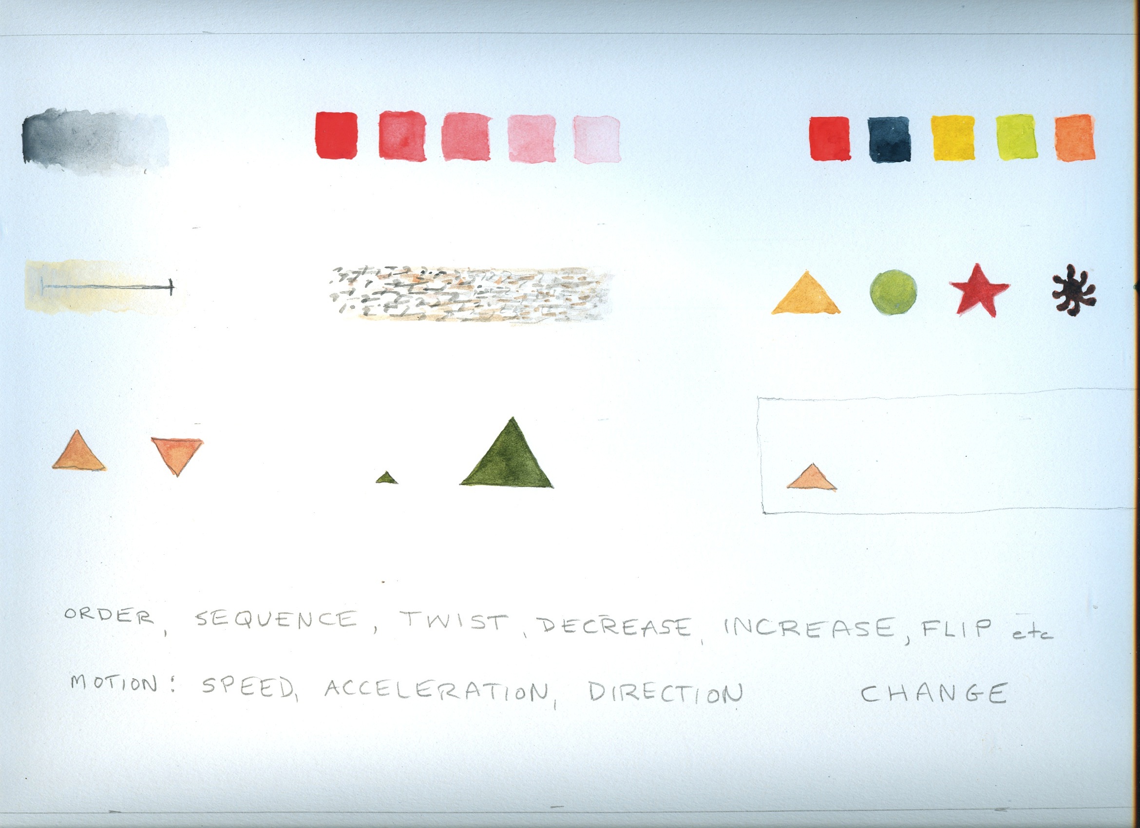
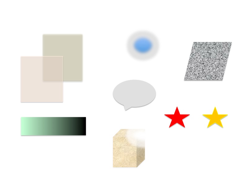
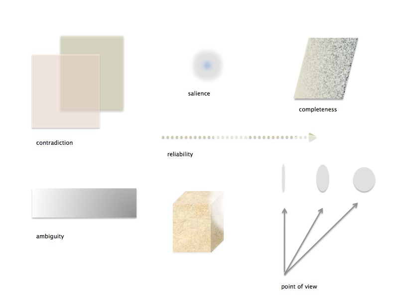
The primitives show the graphical elements and their potential. These would be shared by representational/discovery approaches and modelling/interpretative approaches. The primitives are taken from Jacques Bertin and Leland Wilkinson and include: tone, saturation, color, transparency, texture, shape, orientation, size, and position. Basic dynamic actions listed include: order, sequence, twist, decrease, increased, and flip. Dynamic graphic attributes associated with motion animation are listed as well, but not shown. None of these carry semantic value in themselves, but all can be put at the service of concepts, values, or meaning-producing signs in a standard legend.
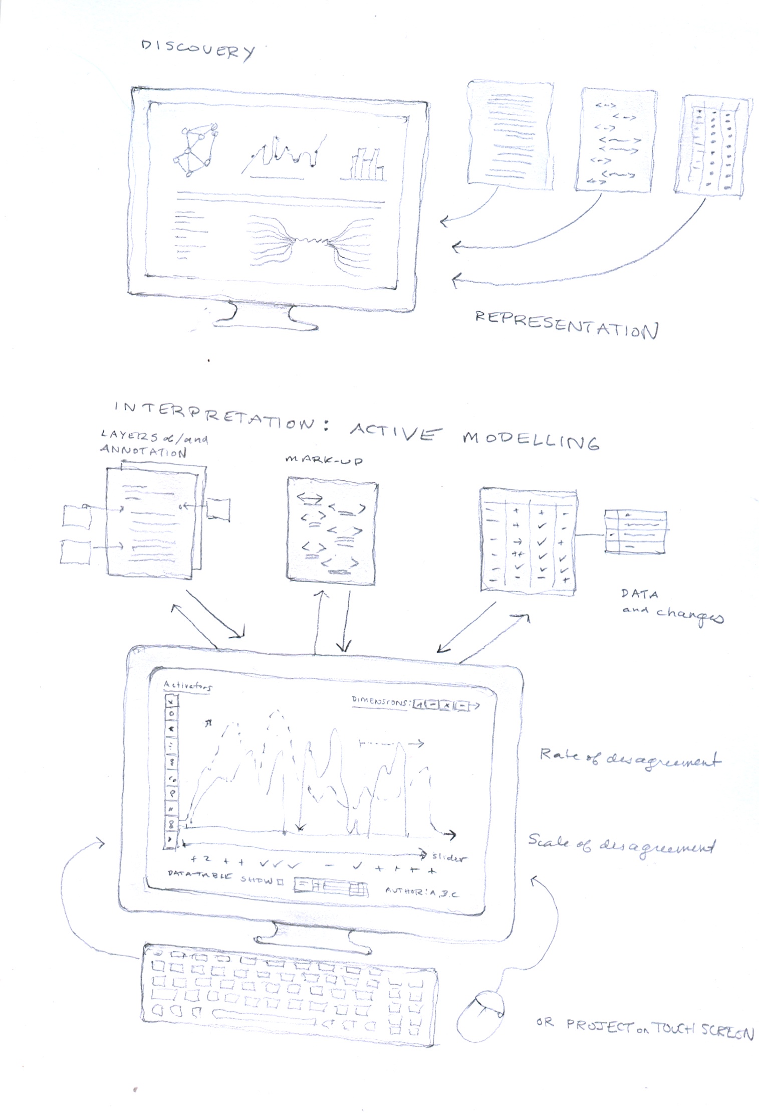
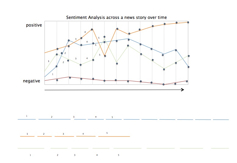
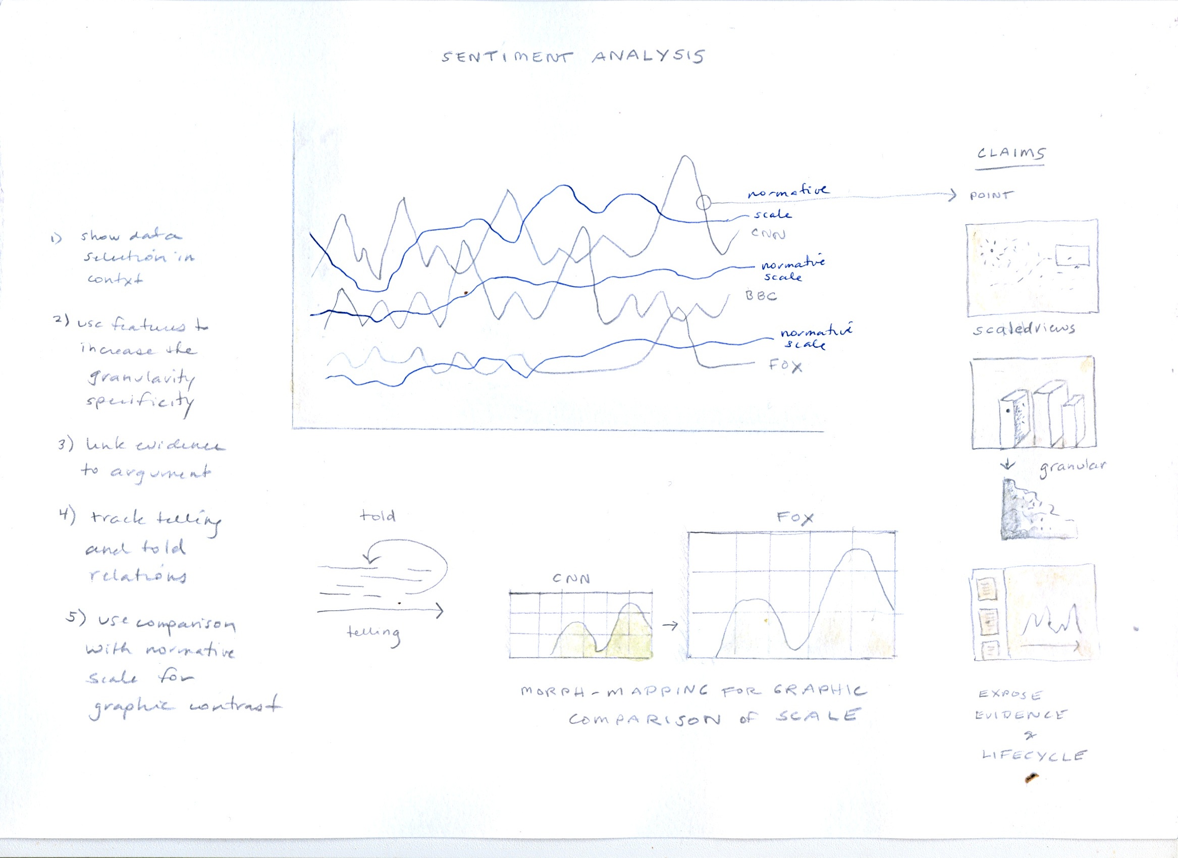
Contrast of approaches showing distinction between discovery and modelling approaches to visualization. Discovery tools allow query into a representation of data (which, in turn, is seen as a representation of a phenomena, information, experience, text, quantity etc.) Display in a representational model consists of graphical entities (lines, bars, graphs, charts, nodes, stars, points, etc.) with attributes. Modelling approaches support active input of interpretation in and through the screen environment. Changes made on the screen as interpretative acts are registered in the tables and data structures and stored. In the example sketched on the screen, a graph showing rates of disagreement (sentiment) is used to generate scales for a relative metric. The images do not have to be restricted to a screen display. They could be projected onto a surface and also used in a touch screen environment. In the screen, attributes are displayed in a palette on the left, dimensions in a strip on the top, and a data display or log of actions is shown on the bottom, below the graph and its scale. Sliders and interpretation layers are also included in the sketch.
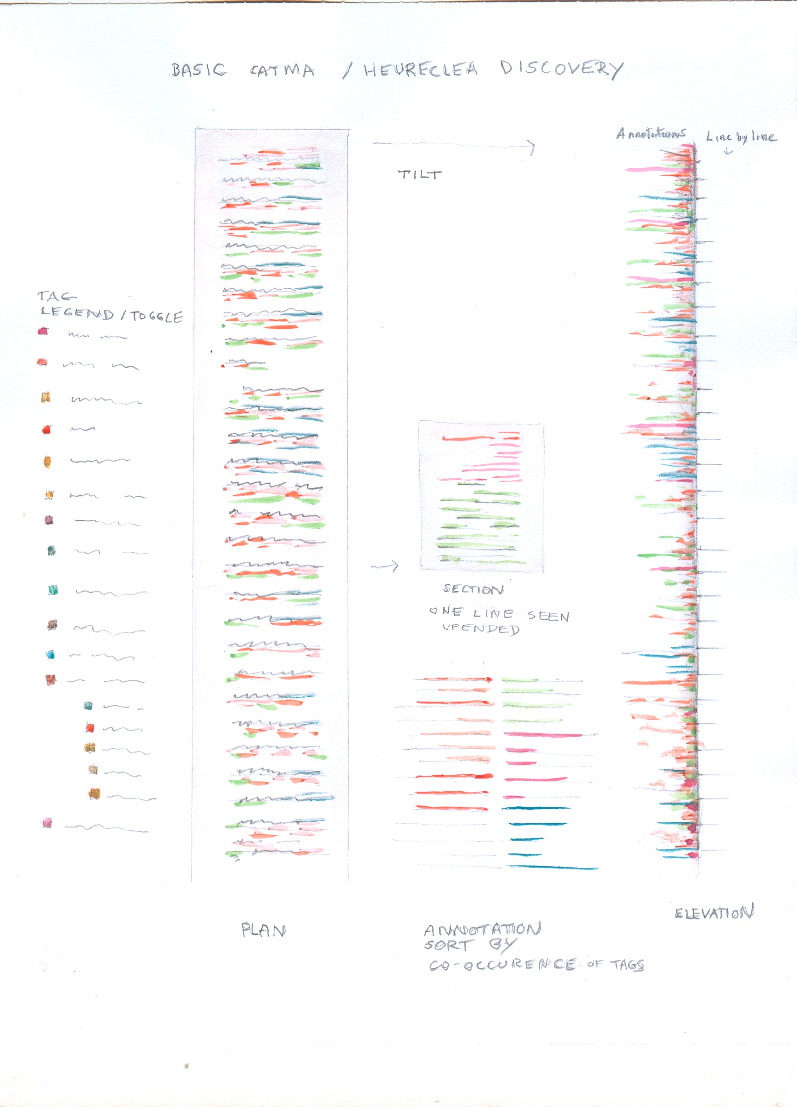
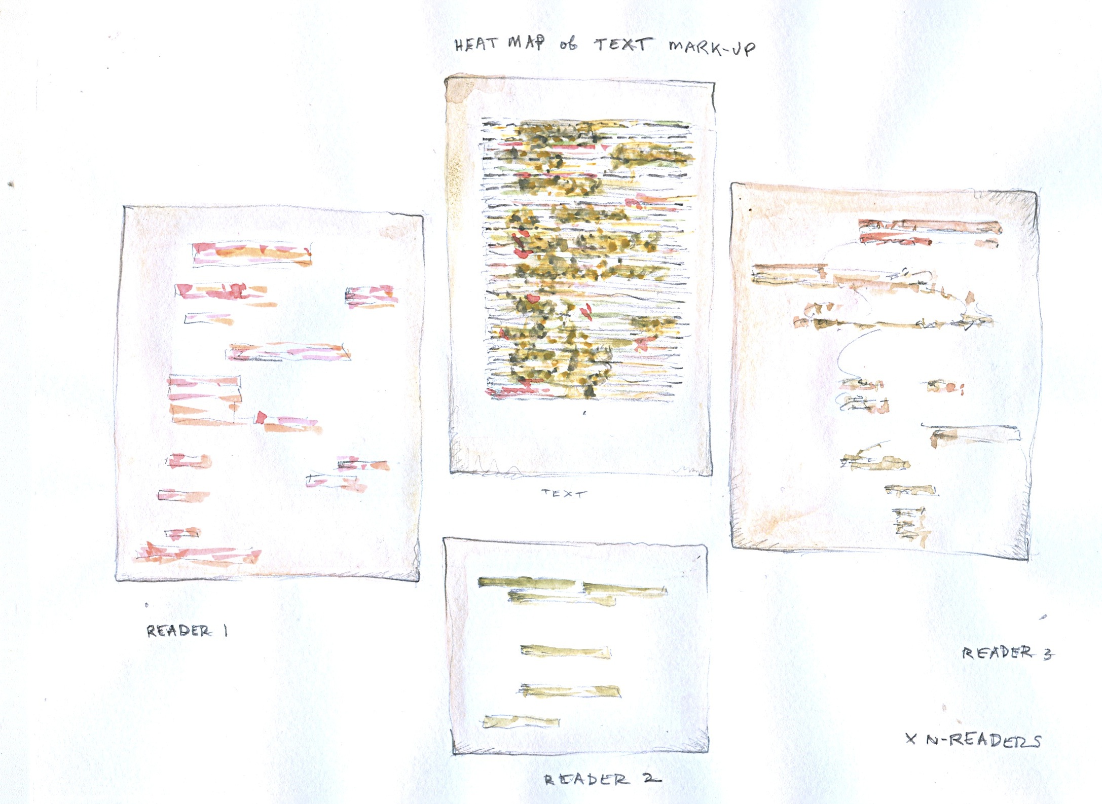
The problem being addressed here is that the markup system used in Catma generates an abundance of graphical information in an awkward, scroll, format. This display of Catma markup shows ways to turn the rich, dense, markup in long scrolling text files into a discovery space through turning, up-ending, and thus comparing the markup. By taking the markup out of a flat scroll, and putting it into a skyline model, it can be viewed in terms of contrasts of quantity, frequency, and location. On-off toggle filters on any part of the mark-up scheme could be added for selective discovery of relations among various tags.
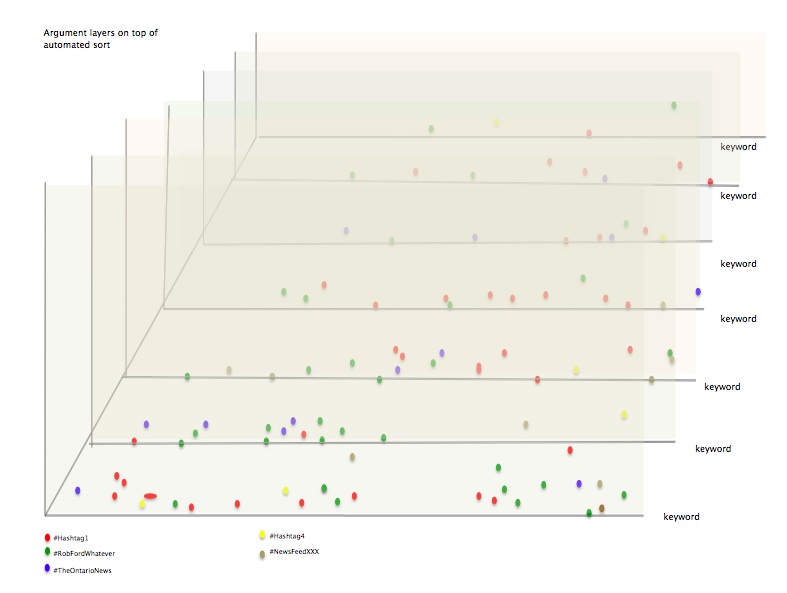
This case study derives from a capture of twitter feeds over a defined, limited, period of time. The result of the capture was too much twitter: a display in which legibility is hampered by clutter and massing. The task was to reduce the confusion by creating a way to filter, slice, and query the data points in the display. The graphical environment needs to serve as a discovery platform in which various attributes of the data (twitter handle, date, theme, sentiment in the tweets, etc.) can be searched, filtered, and displayed. This is a discovery approach, since the main concern is to be able to see patterns in the data on display. The filtering and clutter reducation are assisted by a legend that makes use of basic graphic attributes (color, size, shape, etc.) and a legend. Once displayed, the data could be augmented by a modelling palette if the two-way screen were enabled. But the primary task here is to provide a graphical interface for faceted discovery at multiple levels of granularity.
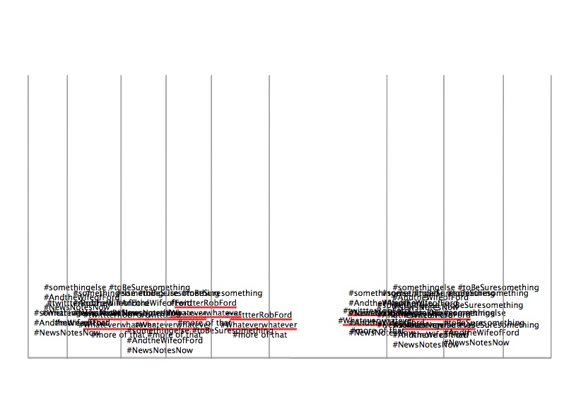
Filtering on tweets by various attributes in the data, specific time stamps, themes, particular themes or sentiment, or any other attribute, allows search, query, and display for discovery. Interpretation layers could also support interpretative input and concept modelling. In this preliminary sketch, the results are displayed on layers whose contents are determined by the attributes that have been searched.
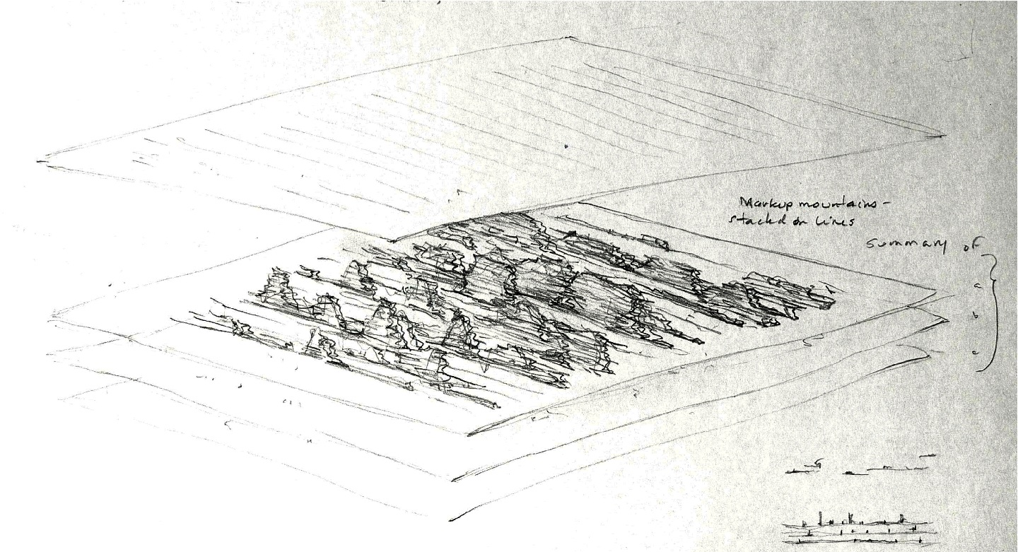
In this image the mark-up mountains are stacked in layers, but also, can be filtered into single layers as part of the discovery and query process. Whether sorted by author, attribute, or other feature of the markup the mark-up lines create a topographic map that is immediately legible in terms of distribution of tags in the text.
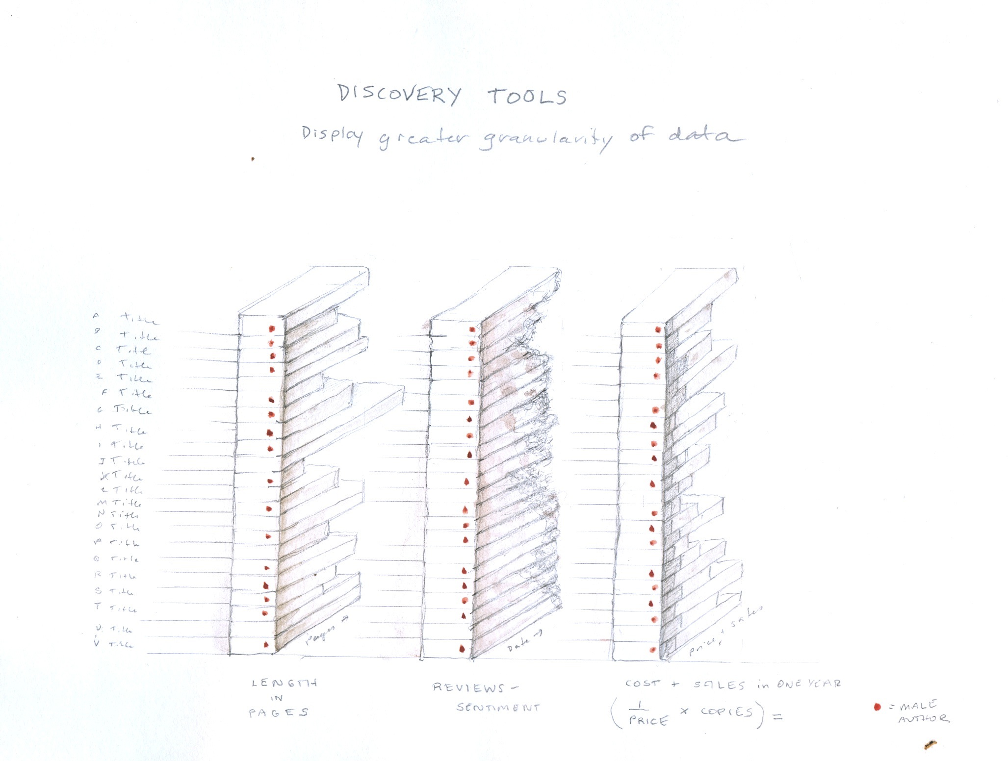
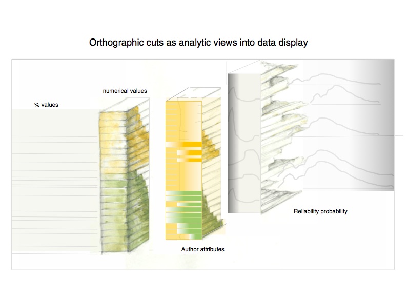
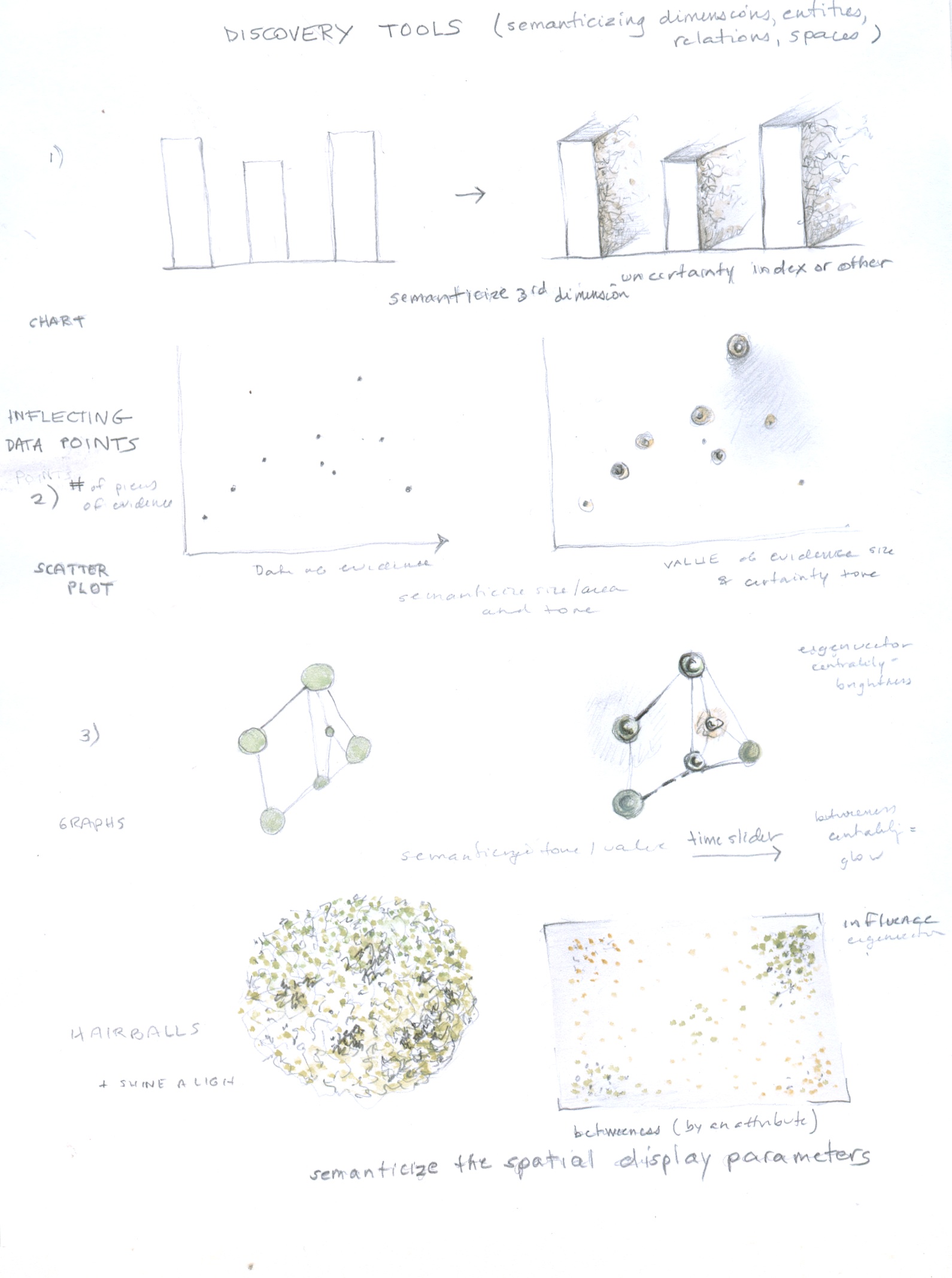
The discovery tools sheet below displays alternatives or augmentations to existing forms of display. Each adds dimensions of data to the current standards by displaying data at a higher level of granularity than at present, exposing the non-homogenous, inflected, varied quality of data points. Working down the sheet, it is possible to see how adding various dimensions based in the attributes of data (usually unexposed) can turn a flat, homogenous, and obfuscating display into one that reveals features of the data through a higher degree of specificity in the visualization. 1) In the first, top, image the third dimension of the bar chart is semanticized, that is, made to carry specific meaning, through a varied texture and opacity, to indicate uncertainty or partial knowledge or other value. 2) In the second image, the scatter plot, the data points are inflected, this means they have been “painted” to offer a more nuanced and varied portrayal of information. 3) In the third image, of a network diagram, the nodes and edges are expressed in a co-dependent relation to each other so that they affect each other. The dimensionality also helps make relationships more legible. 4) In the final, fourth, image of a super-dense network diagram, the data points have been re-sorted in accord with different attributes so their values can be sorted, discovered, and revealed in a filtered search or query. This allows the space of the display to carry semantic values. Each of these discovery tools is also available for modelling, and the number of semantic dimensions that can be attached to the extended bar charts, data points, nodes/edges, and network display can be customized project by project.
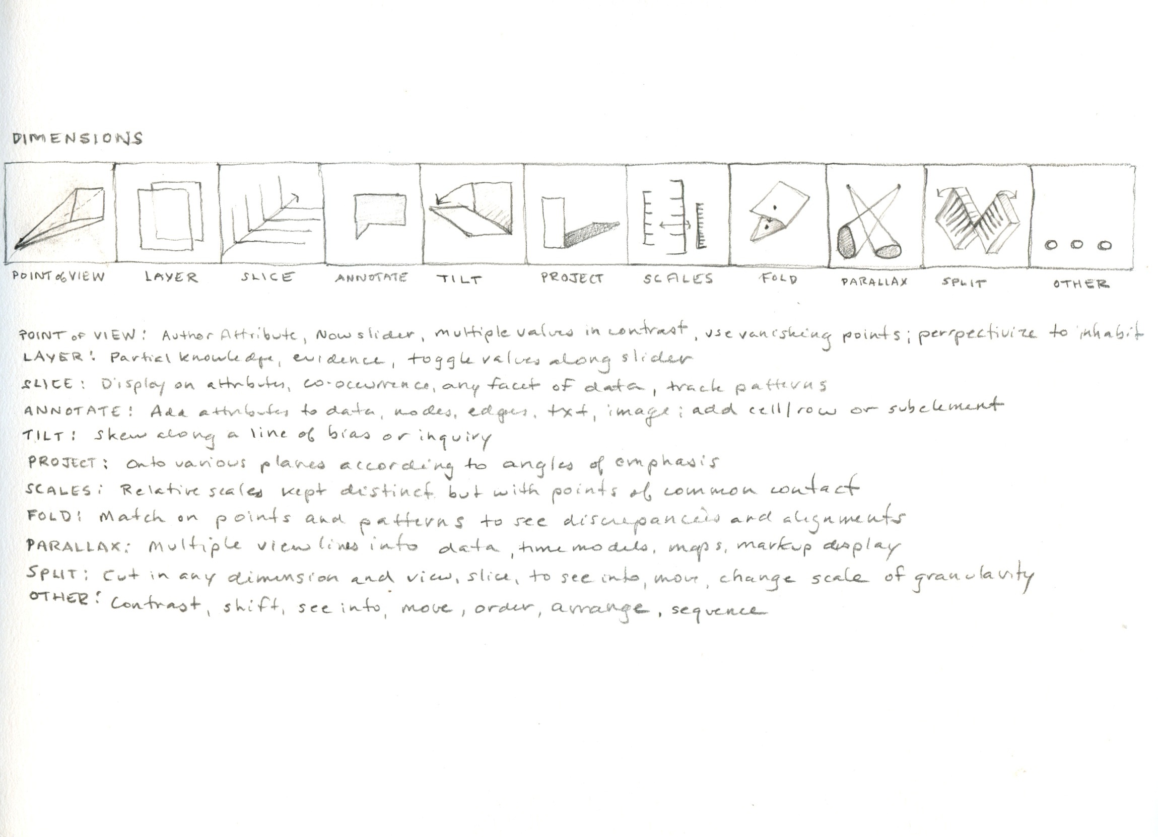
The basic dimensions of concept modelling are contained in this image. The set of graphical moves is not meant to be definitive or exhaustive, but suggestive, though it does comprise the fundamental moves that can dimensionalize flat screen space. The system of concept modelling is extensible and customizable for any project, though conventions of use will lend legibility to the project overall. These dimensions can be linked to interpretative primitives or interpretative moves, as below. The dimensions are literal interventions in and manipulations of the screen space put in the service of conceptual modelling. A “projection”, for instance, should be understood literally and metaphorically-- what kind of shadow or form is cast by a data visualization when it intersects with another plane (a value plane, ideological plane, hegemonic system etc.). Some of these moves, like tilt, for instance, may seem abstruse at first, on account of their unfamiliarity, but they are meant to suggest ways of turning interpretative work into systematic metrics so that graphical displays are generated affectively as well as objectively. This need not make them any less systematic, but the systems are dependent on interpretative values, not mechanistic ones. The model makes the values, and the values become the basis of a system. The display shows how the modelling is working with the dimensions, and making use of them, to transform, manipulate, and understand interpretative approaches to knowledge production in graphical form and platforms.
The graphical elements that can be used for either representational display or modelling interpretation are shown on top, with the understanding that the graphical features of animation are not present: motion, direction, acceleration, change of size or scale, and any other dynamic features. Also, the elements are depicted in standard Cartesian space and need not be constrained in this way. The elements/activators, interpretative moves, combined with the dimensions above, are the foundation of the concept modelling system.
Here a set of graphical activators is being used for interpretative moves within the dimensions noted above.
Shown in the painting of data points or augmentation of charts in the Discovery Suite above, the idea of affective attributes is extensible to almost anyway of generating value on a data point, or as a means of generating a data point. Affective attributes are not simple statements of quantitative value, but are expressions of qualitative value. For example, in creating a map of a particular spatial experience, affective attributes might include the registration of smell, comfort, pleasantness, cold, fear, anxiety etc. such that the geospatial information is generated as “spatial coordinate plus a factor of X”. Such a formulation might also contain a formula for change over time, or modification in relation to any specifiable condition or aspect of the phenomenon. Affective attributes, like other generative and relative metrics, do not have to be arbitrary, but they necessarily include the point of view of their author.
Data inflection is the process by which a graphical input is registered in a table. The table is modified directly, through the input. Not only are values in the table generated from the graphical input, but the table structure may be modified as well. So, as a model is created, modified, and augmented, the data table is generated through a process of mathematical calculation. Regular tables and standard metrics do not have to be the only data structure created in the process. Branching, layered, crazy-quilt tables and other anomalies would be generated by the conceptual modelling, which also registers the relational attributes of these structures.
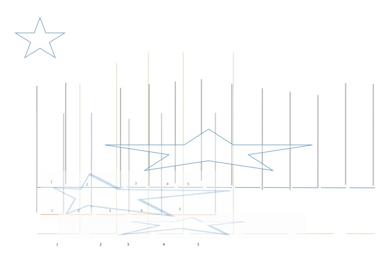
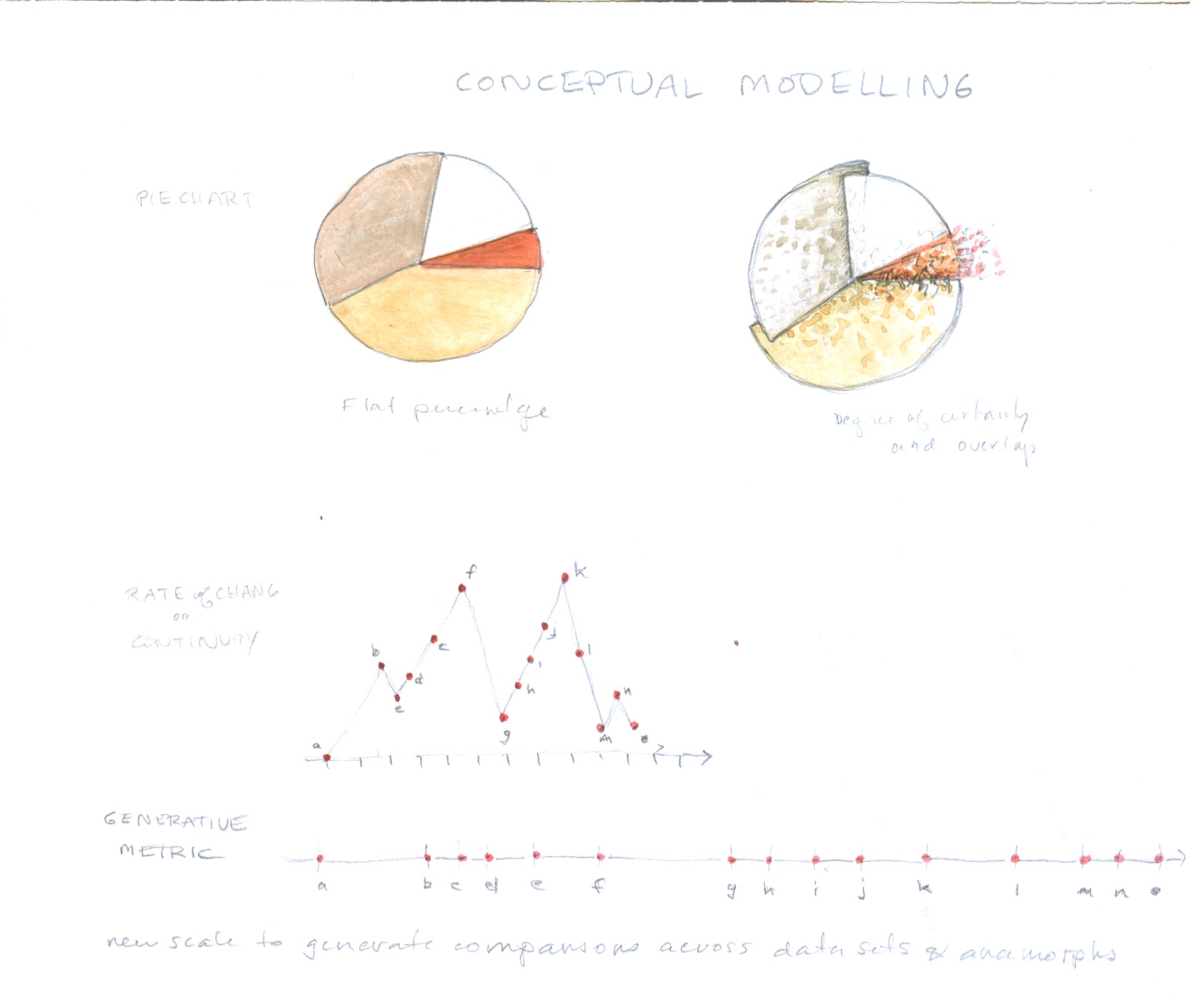
Generative metrics used to create a scale based on line length segments marking the rate of change tracked in a graph. Any comparison of values that generates line segments or bar segments can be used to create a scale and the scale in turn can be used to model a point of view system in accord with its values.
Anamorph scales generated by the process above, now used to render an image in relative scales. Relative scales are a crucial piece of the interpretative, generative, approach to data visualization since they allow statistical norms to be established and then used to create contrasting formal expressions. The star, in this case, is being viewed from the point of view of multiple scales, each generated by a different scale of rate of change of sentiment. The scales are not arbitrary, but based on actual metrics in the represented data. While the first charts are representational, the second set of anamorphic images makes an interpretative move from a direct correlation with quantitative data. Other forms of projection, such as shadow casting, can also be used to graph interpretation.
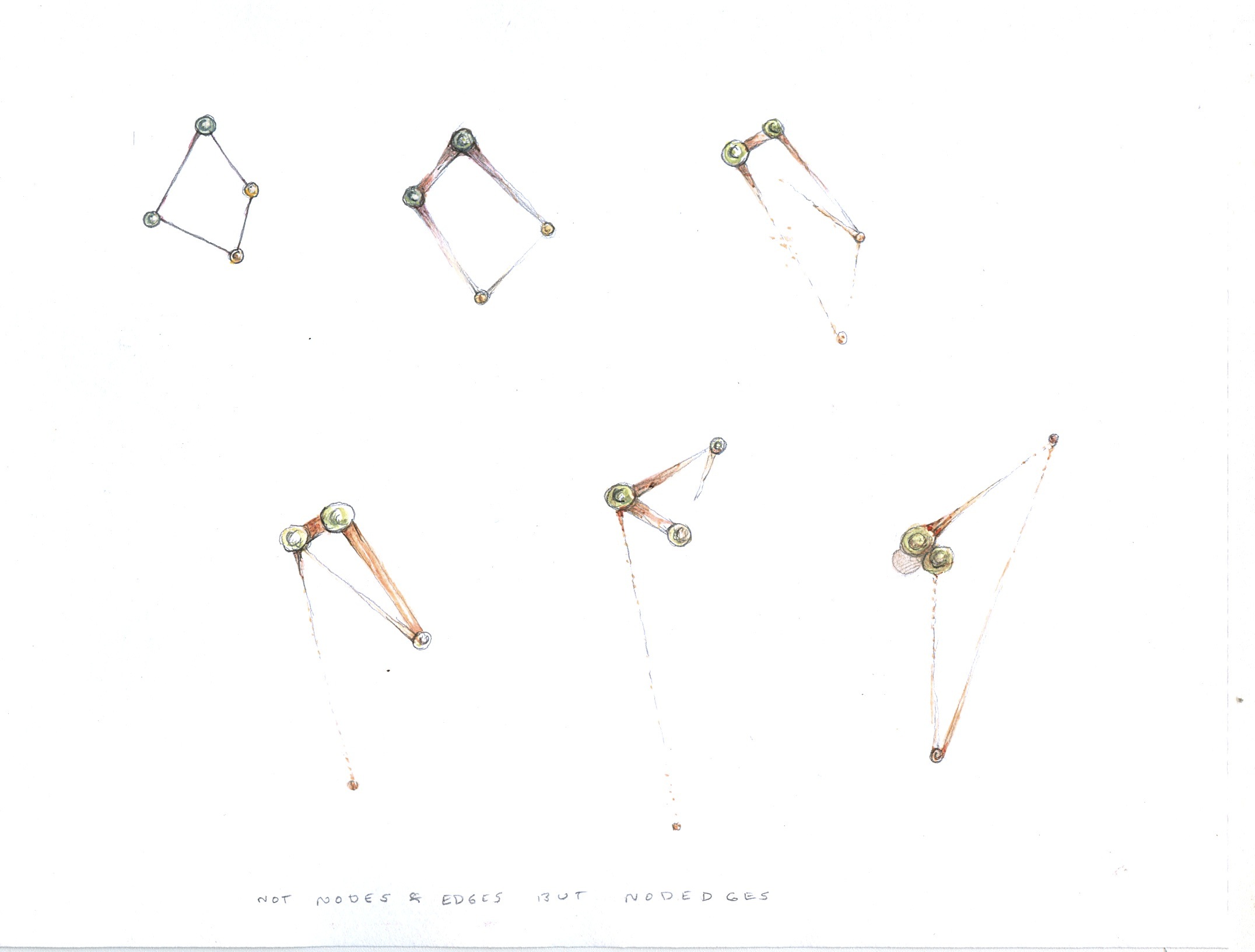
The nodedge collapses the distinction between node and edge in a network graph, making clear the dynamic character of the connection between them. All relationships are thus defined as dynamic, with change over time, and an effect of one node on another along and through an edge, which is also changing scale, force, and flow direction.
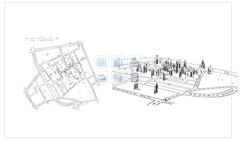
Adding perspective to a data set or scene makes use of basic three-dimensional techniques so that interpretative features can be inscribed into the flat space of conventional display. Here the famous image created by John Snow to track the source of an epidemic to a drinking water supply (left) has been augmented to make explicit that the points on Snow's graph are all individuals, each of whom has a different relation to the lifecycle of events that created the data points. This is an attempt to expose the basic facts of and multiple aspects of data production as an effect of parameterization of lived phenomena. This act is such a fundamental one, and so deeply violent in its inclusions and exclusions, that it needs to be graphically marked within visualizations and yet, almost never is. The graphical language for this intellectual task, which is to expose the interpretative act of data construction, capta creation, has a high charge on it.
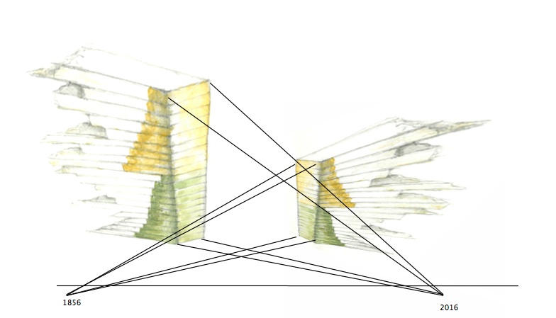
Relative metrics are generated from different chronological scales and different models of historical time. They can be correlated at certain points of alignment, but never fully reconciled since their units, scales, and assumptions about the completeness of their own models are each distinct. The use of relative scales is essential for exposing the differences among taxonomies, world views, value systems, and other features of knowledge production, classification, and management. Like the recovery of parameterization, it is fundamental to the production of a humanistic critique of data visualization in positivist and empirical models.
Sentiment analysis used as demonstration of the switch from display to interpretation. A series of moves are made on the display to enact conceptual modelling in the various facets--charts, graphs, and the mapping of sentiment from the plane of discourse to that of reference.
The augmented pie chart been modified with graphical activators to alter the standard conventions of representational displays. Features show that boundaries are not hard and fast among categories. There is overlap and seepage across categories and the sum is more than a single quantitative value. Below the chart is a generative metric, similar to that used to generate the anamorph scales above. It is not related to the pie chart.
The development of a system of graphically inscribing enunciation in visualizations seems essential to advancing the hermeneutic agenda in knowledge production. The absence of conventions to mark the “speaker” of a visualization, whether it is a display or a model, hampers the development of an approach that acknowledges the discursive modality of visualization. The inclusion of point of view inscribes data within an enunciative system so that the display is expressed from a specific historical and authorial position. This allows for contrast and parallax, multiple views into the same data, and historical, cultural, or other positions to be registered in the display. Author attribution, the explicit use of positionality as a locator for the enunciating subject, and the analysis of the enunciated subject, all need to be marked graphically in features that expose the structuring activity of graphical expressions.
(1) Standard visualization: The work of Ben Schneiderman was key in development of the "overview, zoom, detail" approach to interactive search, query, filter, and display. While extremely useful in many practical circumstances, the approach is grounded in a consumerist model of engagement with text, image, and information through an interface. The design follows engineering approach, and is problem-solving oriented in its basic premises. This has very little to do with the humanistic tasks of reading, studying, engaging with artifacts, documents, or images for the purpose of interpretative work.
(2) Concept modelling explained: The distinction between a representational approach to visualization and concept modelling might need clarification. Think of the distinction between the platforms needed to support the activity of "designing a house" and "modelling a dwelling". In the first instance, you might begin by laying out a plan with a livingroom, diningroom, front door, bedrooms, and so on. This assumes a program of activity that is embodied in the entities that show up in the design. A "front door" already assumes "front-ness" as an aspect of the "house" which also is assumed to contain "rooms" which serve specific functions: eating, living, sleeping. The design environment might contain a kit of windows, walls, doors, and other graphic elements that already embody the entities from which the "house" is composed. Now, consider, instead, a platform that is composed of high-level concepts: shelter, boundaries, ingress and egress, scale, pathways, sightlines, degrees of privacy and proximity and so on. The "model" created as a result is not entity-driven, but concept-driven, and the graphical platform is the environment in which the modelling takes place. The platform does not represent a house, it models a dwelling. A similar analogy could be made by contrasting the platform needed for making a meal comprised of entities (soup, salad, entree, dessert) with that needed for food preparation as a set of concepts (heating, cooling, cutting, mixing, cooking, presenting). The first approach is entity driven, the second is action-driven, and the moves made or actions taken result in an expression. In the first approach, the entities are set in advance in a menu of options, a pick list. When this analogy is applied to the creation of an environment for doing humanistic work, the distinction between a representational, entity-driven, chain of surrogates and a modelling environment is charged with the difference between a mechanistic approach and a hermeneutic one. A mechanistic approach does not allow for the alteration of the data or data structure underlying the representation in a visualization, but the hermeneutic one is premised from the outside by the fact that only that which is directly modelled ends up in the data. Obviously, these two approaches can be combined, and hermeneutic actions can be modelled on top of a mechanistic, representational, display. Keeping the distinction between the two clear, on basic epistemological grounds (representational vs. modelling/constructed) is crucial, as is understanding the difference between an entity-driven environment of fixed elements and attributes and an open-ended modelling environment which produces a model of intellectual work. Representational approaches are, of necessity, expressions of a model, but the modelling act is usually concealed by the chain of surrogacy that hides the original acts of parameterization and data creation. Since the most significant (by which I mean, signification producing) moment in that chain is at the point of the parameterization that produces the data, hiding these terms of production renders the entire chain of surrogacy that follows an expression of obfuscation of a process that cannot be recovered.
(3) Copula statements: The use of “is” in syntactic constructions that title or paraphrase data visualizations is telling. A graph or chart showing partisan demographics, for instance, will be read in the following way: “Fifty per cent of the voting-age population is Democratic.” The &dquo;is” reflects the declarative mode of the graphic presentation, and its obfuscation of its own lifecycle of production. For this reason, I suggest that most visualizations are “representations passing themselves off as presentations.” One of the goals of the concept modelling approach is to make the authoring, production, and decision process of visualization apparent.
(4) Non-representational approaches: The work of Nigel Thrift is crucial here, as are other constructivist approaches to knowledge, such as the work of Ernst von Glasersfeld and others.
(5) Data visualization as an enunciative system: This is a challenge that will require some design research. In addition to mining the conventions of pictorial image production, the project needs to build on narrative theory, linguistic theory, and film theory, where concepts of subjectivity and the enunciative apparatus have been developed. Not all of these are entirely text based, and extending theories of filmic enunciation to visualizations is a good place to begin. Figuring out a set of graphical markers is part of the design research ahead.