
Bible. Old Testament. Song of Solomon.
1. The complaint, and the consolation; or, Night thoughts
2. The Fables of Æesop, and others / With designs on wood, by Thomas Bewick
5. News from nowhere: or, An epoch of rest, being some chapters from Utopian romance
6. The nature of Gothic, a chapter of the stones of Venice
7. Daphnis and Chloe: a most sweet abd pleasant pastoral romance for young ladies
8. The Sphinx
10. Credo
14. Bible.Old Testament. Song of Solomon.
16. Kem byt’? / V. Mai︠a︡kovskiĭ ; ris. N. Shifrin.
17. The ghost in the underblows
19. Bateau ivre
UCLA Call Number: Press coll. Ritchie lib. Schmied
Bible. Old Testament. Song of Solomon. French. Renan. 1925
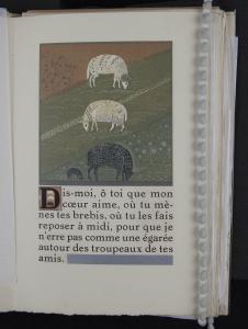
This image shows how Schmied can take a common, everyday–type of picture, one of four sheep grazing, and make it exquisite. On this page he flaunts his artistic and technical skill, and he adds his signature features to the page which identify it with the rest of the book. The large picture of the sheep includes a tremendous amount of detail, especially considering that it was created with woodblock printing. Each different color – and there are many different shades of green alone – required a separate woodblock to be cut, and required a separate pass through the printing press for the page. Thinking of the production work required in such terms, the degree of detail becomes even more striking. Notice the fine rays surrounding the baby lamb in order to make it stand out from the background. Notice that the eyes of each sheep are shaped differently, giving each a different facial expression. don’t miss the tiny delicate gold hooves on the two white sheep, nor the tight spiral curls in silver on the black sheep. Such fine engraving would require a very steady hand indeed, while the graceful silver and gold accents not only light up the image, but also convey a sense of richness and fertility about the pastoral landscape. The design of the page itself has been carefully crafted. The subject matter is influenced by the text, and it is repeated in different scales of size. The tiny images of sheep contained inside the historiated initial letter “D” mirror those in the larger image; even the positions, color, and orientation of the sheep are the same.
The page also contains elements which connect it to the larger context of the book as a whole, specifically Schmied’s signature horizontal bar in silver at the bottom of the page, and the way the frame surrounding the large image has a thicker line at the bottom, thus perhaps repeating the signature horizontal bar in a different scale of size. Finally, the geometric shapes in the wool of the sheep, the two small vertical silver bars in the historiated initial, and the diagonal furrows in the field in the background give a nod in the direction of Art Deco. The top two–thirds of this page is an image framed in a solid silver bar which is about twice as thick on the bottom of the frame.
Inside the frame are fields of weeds or short vegetation through which run diagonal furrow rows. The top field section is light brown, but the other three sections are multicolored green. There are four sheep in the image. The two full–grown white sheep are grazing farthest away, with the white one at the top of the image, or farthest away, facing to the right, the white sheep below that faces to the left, and the adult black sheep below that, or closest to the viewer, faces right. Directly behind the adult black sheep’s back leg,, or to the left of the sheep in the picture, is a small black baby lamb, also grazing facing the right. Again, all of this image is inside a flat silver frame. Below the frame on the left is a historiated initial letter “D” in black ink which is contained in a brown box with a thin black outline. Within that capital letter D there are three sheep silhouettes, appearing to be one on top of the other, with the top white sheep facing right, the middle white sheep facing left, and the bottom black sheet facing right, all in exactly the same orientation as the larger image above. To the right and wrapping around under the historiated initial is text printed in black. The very bottom line of text is only one word long, and to the right of that is one of Schmied’s signature horizontal rectangular bars, this one in silver.
Bible. Old Testament. Song of Solomon. French. Renan. 1925
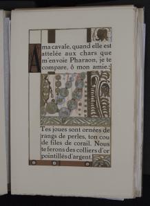
This is an example of Schmied’s slightly more abstract or graphic images. Yet it is still focused on luxury, with the thickly–printed gold and silver inks. This image also shows departures from, or playing with, some of the standard design features he uses throughout the book. Ward Ritchie quotes an article written by P.J. Agnoulvent, who says about Schmied, “the artist realized that he could not compete with the eloquence of the author if he tried to materialize his thoughts by images too precise. He, therefore, began each chapter with a monumental image, large and imposing, and allied it to an impressionistic decoration, formed by harmonies corresponding to those of the thoughts of the writer.” On the bottom of this page, the text talks about circles of gold and studs of silver, presumably in the form of a necklace. The corresponding image does not show a clearly–rendered necklace; rather it shows some abstract round shapes of gold and silver, which, in fact, are somewhat similar to the round shapes of the curly wool on the white sheep in the previous image. And again, the use of silver and gold ink, thickly applied in this case, imbues the image with a feel of luxury. The page layout and division of text with image, or rather the division of image with text on this page is rather unusual. And the playful way the plant tendrils start to encroach into the text area, which is not demarcated by a border, is very experimental. It runs counter to the guidelines which Schmied seems to always follow; it is almost as if Schmied is saying that his “rules exist to be broken,” at least once.
Bible. Old Testament. Song of Solomon. French. Renan. 1925
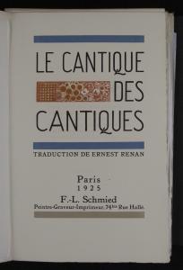
The title page for Le Cantique des Cantiques establishes the design convention of the thick, bold, rectangular bars that will be used, re–used, scaled, echoed, and even rotated on their axes throughout the book in order to maintain a common element within each page to relate it to the other pages. This image of the book’s title page has a one–inch–wide royal blue long rectangular bar across the top of the page. Below that in a tall thin black sanserif all–caps font is the book’s title, Le Cantique (on the top line) des (on the middle line) Cantiques, (on the bottom line of the title section), and underlining that is another blue bar like the first. Inset in the middle line to the left of the word “des” is another slightly thicker but shorter rectangular bar printed with a fruit and flora motif in reddish-orange and a matte gold color. Directly below the bottom blue line of the page’s title section, in small–sized all–caps black font with a discreet serif is the line, “TRADUCTION DE ERNEST RENAN.” Then, centered in the bottom third of the page in a black serif font using both upper– and lower–case letters , is a pyramid–shaped stack of text. The top line says “Paris” and the following line says “1925.” Below that is &ldqou;F.–L. Schmied,” and below that in an even finer print is “Peintre – Graveur – Imprimeur, 74bis Rue Hallé.” Finally, at the very bottom of the page is another bar like the first two blue ones, but this one is in a pale dove grey color instead. The right edge of the page is gently deckled.
Bible. Old Testament. Song of Solomon. French. Renan. 1925
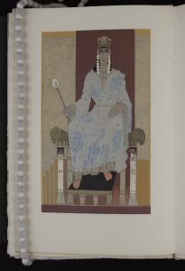
This image of King Solomon sitting upon his throne contains subtle characteristics which indicate several of the international influences on Schmied’s art execution. In addition it provides yet another opportunity to project the image of luxury so beloved in the French Art Deco tradition. >Le Cantique des Cantiques contains only perhaps three or four images of people throughout the whole book. This image of King Solomon is interesting because it shows several of the international aesthetic principles which influenced Schmied’s art. Schmied was not particularly interested in the European and American art of his time, but he drew artistic inspiration from North Africa / Egypt (where Howard Carter had recently discovered the tomb of Tutankhamen), the Middle East, and Japan. The slightly awkward perspective used to draw King Solomon seated in his throne is reminiscent of ancient Egyptian art which depicts rulers on thrones in a similar manner. Schmied has subtlely updated the image by positioning the viewer just off–center instead of facing the picture straight–on. The imagery of the rams’ heads on the arms of the throne calls to mind Babylonian or Assyrian sculpture. Although the method of wrapping the robe is entirely different from how Japanese wear kimono, the way Schmied depicts the folds of cloth in two dimensions is similar to how Japanese ukiyoe, or woodblock, artists represent folds of cloth. Hearkening back again to the luxury of French Art Deco tradition, King Solomon in this picture could serve as a poster child. He is decked out in all the trappings of royalty – from his position on the ornate elevated throne, to the silken robe and jeweled ring he is wearing, to his crown, and of course the scepter he holds. Even the full–sized image, and the attention to detail of all the various colors and textures within the image, convey a sense of importance about the subject depicted.
Bible. Old Testament. Song of Solomon. French. Renan. 1925
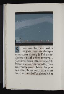
This beautiful image of the dark, starry night sky shimmering above the city walls shows how Schmied takes an area of an image that most people would envision as a single flat color – the night sky – and instead adds another very subtle layer of a similar color, with stunning results. This page also shows, in the text area, an unfortunate but beautiful example of the tanning that happened as a result of the page’s being next to another page printed with the velvet black ink. According to Michael Sheehe, “Shmied rarely illustrated specific moments of the texts from which he worked, but rather evoked scenes as he interpreted them.” This night sky landscape does just that. It does not show anyone doing anything, but it generates a particular almost unconscious feeling in the viewer. This image also shows clearly how close two different shades of a particular color, for example, blue, or silver, can be while still being treated as separate colors, each worthy of their own woodblock engraving. This technique adds much visual depth to the image. Finally, note the top and bottom borders of the image, which provide lovely clear examples of the previously–discussed special velvet–black ink which Schmied created, and which have wreaked havoc on so many of the pages within the book.
Publisher: F.-L. Schmied
Publication Place: Paris
Date of Publication: 1925
Dimensions 26cm x 18cmC
Physical Description:
This is an unbound book and is kept in a custom–made box for protection during storage. The first thing one notices upon removing the book from the box is the cream–colored wrapper that encloses the pages, letting the bottom deckled edges of the pages peek out. Under the translucent wrapper cover, on the front cover of the wrapper, is a vertically–oriented rectangular woodblock print of a stylized image of two birds in flight. This image is primarily in golds, light browns, white, and a greenish–grey, with muted blue and purple accent bars. Inside the first leaf of the book is a bookplate sticker which designates the book as part of “The Ward Ritchie Press Collection at the William Andrews Clark Memorial Library.” The next item of interest is a blank page on which there is a handwritten inscription in pencil from F. L. Schmied in French, dated January 1926.
The frontispiece opposite the title page has a horizontal rather rough–cut woodblock print in brownish orange of fruits and flora, underneath which is written in italic font, “Cette édition établie par F.–L. Schmied sur l’initiative d’un groupe d’amateurs, a été tirée à cent dix exemplaires. Les six premiers étant exemplaires de collaborateurs et comportant une double suite des gravures. Exemplaire d’auteur à F.–L. SCMIED” The title page has a similar horizontal woodblock print of fruits, flora and a fence, which is printed in the same brownish–orange and a dull gold color. The title, “LE CANTIQUE DES CANTIQUES,” in tall thin black majuscule letters wraps around the right side of the image. The title area in the top two thirds of the page is delimited at top and bottom by thick bold blue horizontal bands. Directly below the bottom blue band in smaller majuscule letters is the name of the translator, “TRADUCTION DE ERNEST RENAN.” At the bottom of the title page is a thick horizontal band which matches the others, but in dove–grey, and centered above that are four lines: “Paris,” “1925,” “F.–L. Schmied,” “Peintre–Graveur–Imprimeur, 74bis Rue Hallé.” Curiously, following the first title page there is a second leaf with the frontispiece and title page identical to the first. Next, there is a blank page with two short tanned bars. This faces what is either a half–title page or possibly a page that could be used for a spine label. The book title is printed vertically in gold ink, with a short black bar at the top and at the bottom of the title. The next leaf contains a page with a rather detailed tanned impression of a medallion, and the following page contains the full–color medallion itself. The medallion contains a profile of a head, in browns, neutrals, grey and white, dressed in a tall headdress with beads hanging down in front of the ears. Geometric lines and shapes fill the background. The bound copy of this book referred to in the Provenance section had this medallion image affixed to the front cover, so this image was likely intended to be removed prior to binding to be used for exterior decoration of the book.
The colophon at the end of the book has a thick gold bar at the top, followed with italic text, “L’Ornementation, la Composition et l’Ordonnance de cet ouvrage sont l’æuvre de F.–L. SCHMIED qui en a é galement execute la gravure sur bois et l’impression sur ses presses â bras.” Between two short vertical gold bars is set in two lines, “Collaborateur: Pierre Bouchet,”; followed by another line,“Graveur et Pressier.” The vertical rectangular printer’s device in black and orange– red ink is at the bottom of the page, and just above it is printed, “Achevé d’imprimer à la Noël 1925.”
Provenance:
A total of one hundred and ten copies of this book were created in 1925. The William Andrews Clark Memorial Library’s copy was previously part of Southern California printer Ward Ritchie’s personal collection which the Library received upon his death in 1996. Ritchie had collected Schmied’s books in particular since he had held an inspirational apprenticeship with Schmied at the beginning of his printing career. A beautifully bound version of this book, with additional tipped in watercolors, sold at Christie’s Auction House in 2012 for $62,000. The copy the Clark Library owns, being unbound and without the additional watercolor illustrations, would presumably have a lower estimated value.
Condition:
This unbound book is in wonderful condition. The very edge of the bottom deckled page edges where they peek out from the wrapper are tanned or dirty and have turned dark. There are one or two faint smudges throughout the book, showing that it has been read, and what I believe is a faint footprint on one of the bank leaves. Otherwise the pages are crisp and clean and the images bright and thick with ink. Unfortunately on many of the pages there is discoloration wherever a page faced up against another page which contained Schmied’s lovely thick and velvety black ink. At every point where paper was in contact with that particular black ink, the pages are heavily tanned. As a result there is a mirror image on facing pages primarily of the black ink, but to a limited extent of the other colors as well. This is due to the secret chemical composition of the ink that Schmied used, which is purported to have contained too much linseed oil. “He was particularly proud of his inks, which included compounds of metallic dusts and a unique velvety black whose formula he kept secret. Unfortunately in this production the black contained too much linseed oil, which soaked into the leaves of all 110 copies of the book…” Every extant copy of this edition has the same problem. Currently there are protective sheets of tissue inserted into each page fold, but it is evident that these are a recent addition, since there is no discoloration of the tissue pages. It is interesting to note, however, that the chemical composition of the ink used for the letterpress printing of the text must have been significantly different, since the regular black text letters did not cause any discoloration on adjacent pages.
Additional Info:
As I was conducting background research on Schmied and on his Cantique des Cantiques, I came across references to a recently–published (2013) book in French by Danuta Cichocka which apparently investigates archival evidence of records kept by the Hungarian artist S which shows that worked behind the scenes as a “ghost illustrator” for Schmied for many years. This is a new and intriguing concept, but it is currently being debated. One blog poster, for example, argues that Schmied himself was responsible for more of the artistic work that Cichocka attempts to attribute to Miklos. He points out that Cichocka’s book provides a unilateral focus which is overly biased in favor of Miklos, and that there still remains a significant amount of incongruity which Cichocka does not resolve in her book. We do know, however, that Schmied and Miklos were at least familiar with each other. In Schmied’s new studio on Rue Halle when Ward Ritchie was there for his apprenticeship, “there were several pieces of modern sculpture by the Hungarian artist, Gustave Miklos.&rdqou; And they both associated with the same set of friends. There is a note of Miklos’s name and address at the end of Ward Ritchie’s 1932 notebook, taken down during the short period after he returned to Paris from his extensive travels in Germany and before he returned to the U.S. We also know that it was not unheard of for Schmied to outsource some of the illustration work for his books. “Artists such as Goulden, Barbier, Jouve, Bergue, and Sureda were commissioned to provide illustrations for books which Schmied himself did not illustrate.” And the year 1925 was a busy year for Schmied. He relocated his studio to larger quarters and hired additional workers to help him with the printing, in addition to completing Cantique des Cantiques. So, although until further research is conducted, and perhaps more archival material is discovered, we will not be able to determine whether, or to what degree, Miklos participated in the creation of Cantique des Cantiques, we can at least acknowledge that Schmied probably had the means and may have had the motivation to contract with Miklos for artwork.
Interpretation:
François–Louis Schmied’s Cantique des Cantiques sits squarely at the intersection of the three primary concepts, “Modern,” “Art,” and “Book,” which are inherent and interconnected in the title and design of this online exhibit, “Modern Art of the Book.”
The Concept of “Modern”
The majority of Schmied’s work, and specifically his Cantique des Cantiques, provides exemplary evidence of the major characteristics of the French Art Deco movement, which was most active in France in the 1920s and 1930s between the two World Wars. The style is often characterized by rich colors, bold geometric shapes and lavish ornamentation [Footnote 1], as well as ’…those hallmarks of true Parisian art–déco – elitism, luxury of materials, sumptuous color, and a tendency toward the unique.” [Footnote 2] – all of which Schmied’s Cantique des Cantiques showcases. In fact, “the sumptuousness of Schmied’s work has often obscured the fact that he was a highly gifted modernist designer.” [Footnote 3] “Song of Songs [is] often cited as the most exuberant of his works and the pinnacle of Art Deco book design.” [Footnote 4]
The Concept of “Art”
Simply looking through the pages of this book will provide ample proof that a significant amount of artistry was involved in its production. The artistry ranges from the creation of a unique and finely–detailed typeface, to the design and colors of the images and page layout, to the technical skill with which the multiple layers of ink were applied, and even to, arguably, the quality of the translation of the text from Hebrew to French. Attention to aesthetics and to the quality of materials and the production process is apparent in every detail. Ward Ritchie says of Cantique des Cantiques, “Schmied cloaked his early work in color and decoration, and this is perhaps the best example of his uninhibited period. It is gorgeous in abundance and exuberance, unlike any book an American or English designer would ever do. There are no static pages in it – each opening is new and different, making it more of an art form than a book." [Footnote 5]
Again, just the act of turning the pages to look at each new presentation of content makes the reader feel as if she or he is in a museum; the slightly exaggerated perspective of the pictures and the paths that lead from the front of the picture towards the back draw the reader visually deeper and deeper into the image. Even the degree of detail in the images has the same magnetic effect; the reader looks closer and closer at the image, until he or she wants to see what is just over that hill or around that corner. That is the effect of viewing art instead of just a pretty picture.
The Concept of the “Book”
For Schmied, the book, and not merely the page, is the fundamental vehicle to represent the art. Each page is designed differently, so as to create the best fit between the images and the text, but even as each page is unique, they all come together to form the single unit of the book. Schmied plays with the creamy white blank space on the page, with the exquisite detail and rich color of the images, and with the steady black and white visual pattern that text creates. Each turn of the page opens to a fresh layout and new ratio of the elements. While sometimes an individual mise–en–page may appear, say, top–heavy, inevitably the sense of balance is restored within the next several pages – precisely because, while Schmied manages layout at the level of granularity of the individual page, he does so in order to ensure the cohesiveness of the layout and presentation of the book as a whole.
One unique design characteristic which Schmied frequently uses in his books, and which functions especially effectively to unite the otherwise disparate images and text layouts, is his signature usage of thick horizontal, or occasionally vertical, bars. Often he places the bars at the top of the page above the first line of text, and at the bottom of the page just below the final line of text. But he also incorporates them into the middle of longer sections of text to help orient the eyes within the page. Often the bars are a single solid color, which makes a strong visual statement. But sometimes the bars are ornately patterned, and occasionally there is an image contained within a bar. Schmied also takes the same theme of the bar, scales it down in size, and uses it to create frames around images and historiated initials. Many of the pictures throughout the book are contained in such frames, which are generally slightly thicker at the bottom than on the sides and top. As Burlingham explains, “Shmied’s layouts are also arresting, the illustrations and the typography in close interplay but demarcated by broad strips of color. Here and there a trickle of text serves as mortar for two blocks of color, or vice versa; it is hard to say which illustrates which. Sometimes accused of creating unbalanced pages, Schmied claimed that he always designed his books as artistic unities.” [Footnote 6] Ward Ritchie quotes Henry L. Bullen as he astutely points out that “[Schmied’s] use of strong type faces has been criticized by those who fail to realize that if not strong they would be obscured by the vividness of his color effects.”[Footnote 7] Cantique des Cantiques is visually powerful on all fronts.
References:
[1] Wikipedia, “Art Deco,” Wikipedia, the Free Encyclopedia, December 14, 2014,
https://en.wikipedia.org/w/index.php?title=Art_Deco&oldid=637912827.
[2] W. Michael Sheehe, “FL Schmied: Art Deco Illustrator,” American Book Collector 3 (June 1980): 4.
[3] Alastair Duncan, Art Nouveau and Art Deco Bookbinding: French Masterpieces, 1880–1940 (New York: Abrams, 1989).
[4] Cynthia Burlingham, Bruce Whiteman, and Hammer Museum, The World from Here: Treasures of the Great Libraries of Los Angeles (Los Angeles: UCLA Grunwald Center for the Graphic Arts, Hammer Museum, Distributed by Getty Publications, 2001), 163.
[5] Ward Ritchie, Francç ois–Louis Schmied, Artist, Engraver, Printer: Some Memories and a Bibliography(Tucson: Graduate Library School, University of Arizona, 1976), 6.
[6] Burlingham, Whiteman, and Hammer Museum., The World from Here, 163.
[7] Ritchie, Francçois–Louis Schmied, Artist, Engraver, Printer, 5.
Text Content Description:
This text, Le Cantique des Cantiques, is a French translation by Ernest Renan from the Hebrew text of the Song of Songs, which is one of the books in the Jewish Kethuvim (The Writings) section of the Tanakh (Written Torah), or one of the books in the Christian Old Testament. A first impression might be that biblical subject matter seems rather incongruous, and possibly even a little out of character, with the general subject matter of other works produced and created by Schmied. But upon closer review of the Song of Songs, the selection begins to make sense. (See http://www.mechon-mamre.org/p/pt/pt3001.htm for a verse-by-verse translation into English.)
The Song of Songs, although included by tradition as a book in the Bible, is actually quite different from the rest of the books in the Bible. There is not a straightforward narrative to the work, and the voice of the narrator alternates frequently between two lovers, so for modern readers it is rather challenging to understand. Basically it concerns the relations between two lovers who flirt with each other, praise each other, pine for each other, search for each other, and meet and take delight in each other. It contains a number of quite lovely and sensual passages which are well–suited to the emotional intensity evoked by Schmied’s images. There are many verses containing analogies to specific imagery which Schmied draws upon when creating his illustrations, for example Chapter 7 Verse 4, “Thy two breasts are like two fawns that are twins of a gazelle.” Simply from reading the text I do not understand what that means, although it does sound nice, but Schmied’s illustration of two large–eyed fawns grazing in front of a deep golden valley helps to make some sense out of the verse. Many of the other analogies contain references to various plants, flowers, and herbs, which show up prolifically and beautifully in Schmied’s images, either identifiably or more abstractly. The Jewish and Christian traditions read much into the text and discern it to represent God’s love for His people, but Schmied takes it much more literally for the purposes of illustration.
Contributor: Cecilia Platz