
The ghost in the underblows.
1. The complaint, and the consolation; or, Night thoughts
2. The Fables of Æesop, and others / With designs on wood, by Thomas Bewick
5. News from nowhere: or, An epoch of rest, being some chapters from Utopian romance
6. The nature of Gothic, a chapter of the stones of Venice
7. Daphnis and Chloe: a most sweet abd pleasant pastoral romance for young ladies
8. The Sphinx
10. Credo
14. Bible.Old Testament. Song of Solomon.
16. Kem byt’? / V. Mai︠a︡kovskiĭ ; ris. N. Shifrin.
17. The ghost in the underblows
19. Bateau ivre
UCLA Call Number: Press coll. Ritchie
The ghost in the underblows.
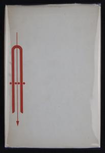
This dust jacket is printed on the same off–white wove paper used in the interior of the book. It features a design by Alvin Lustig (1915–1955) printed in orange–red with the title of the work printed on the spine. The black linen binding underneath contains an imprint of this design with the title in gilt lettering. The designer of the book used bits of shaped metal – squares, circles, triangles, and lines – to make patterns and designs. One such design is printed in orange on the cover of the book.
The ghost in the underblows.
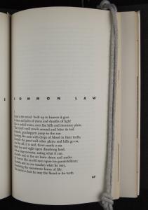
This detail of Alvin Lustig’s design for ‘Common Law’ in The Ghost in the Underblows shows the layer of black ink atop the orange below it.
The ghost in the underblows.
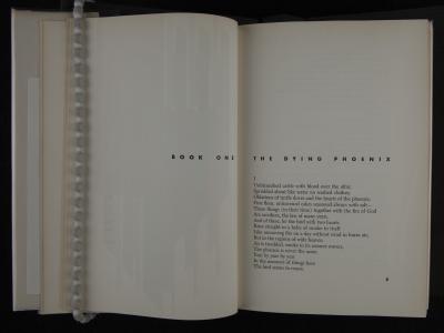
This image is representative of the presentation of poem’s text, printed in a bold, modern sans serif. The opening to each book contains much white space, although the rest of the pages are filled with text. The heavily punched type makes depressions that can be seen slightly emerging on the other side of the page.
The ghost in the underblows.
This detail of Alvin Lustig’s design for ‘Common Law’ in The Ghost in the Underblows shows the layer of black ink atop the orange below it.
The ghost in the underblows.<
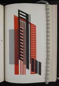
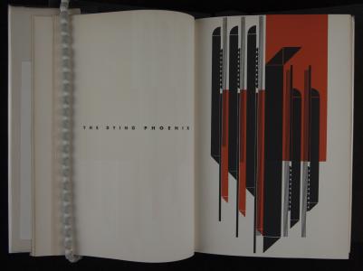
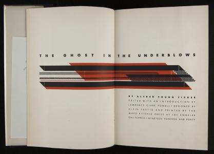
This two–page title design in orange–red and black is a design made by Alvin Lustig from pieces of typographic ornament. The font used in the book is a modern style sans serif printed boldly in a rich black. Alvin Lustig (1915–1955) was adamant that contemporary book designers should not be beholden to conventional wisdom about the proportions of text on a page, the size of margins, what font to use, or, in short, any material or design decision as a rule. This title opening for The Ghost in the Underblows features horizontal red and black bands and small geometric shapes arranged in pattern. This is the title page re–imagined. Of Lustig’s designs for Ghost, Ritchie said, he became interested in Fisher’s book and offered to make a series of illustrations from the rectangles, the squares, the circles, and the rules that were available in typographical material. It was a complete tour–de–force, magnificent in its conception and in its execution. For each of the chapters of Fisher’s Ghost, Lustig created a dramatic full–page of ornaments, which were spectacular and never before nor since matched in this particular medium of illustration. For this alone, the book has a very important place in American typography, and has since been recognized in practically every book on modern American book design as a landmark in typographic illustration and design. Lustig lamented that book design had lost focus on the “visual symbol,” and that the goal of contemporary design was to rescue the vitality.
The ghost in the underblows.
This image is representative of the presentation of poem’s text, printed in a bold, modern sans serif. The opening to each book contains much white space, although the rest of the pages are filled with text. The heavily punched type makes depressions that can be seen slightly emerging on the other side of the page.
Content description
Contributor:
Contribution date:
Full title
Creator: Fisher, Alfred Young
Publisher:Ward Ritchie Press
Publication Place: Los Angeles
Date of Publication: 1940
Dimensions 23 cm x 15 x 3cm
Technologies of Production: letterpress printing
Physical Description:
The book is bound in black linen and blind stamped with gold letters on the spine.
The embossing of the binding matches the orange printed ornaments which are mirrored on front and back covers, as well as spine. The dust jacket is printed on the same paper as the text of the book.
Moving inside, there are 24 preliminary pages comprised of four blank flyleaves, a half title page, title page, copyright page with handwritten number denoting which of the 300 copies this is (in this case ‘2’), dedication, table of contents, introduction by Lawrence Clark Powell, and 328 printed pages of poetry divided into ten books.
Ten full–page typographic abstractions appear at the outset of each book and are printed in orange–red and black, as well as one sprawling design spread across the title pages. The portion of the title design on the verso of the title spread can be seen showing through the half title. The printing of the type as well as the typographical designs can be seen faintly on the reverse pages throughout the book.
Provenance:
This copy (no. 2 of 300) was likely gifted by Lawrence Clark Powell with the rest of the materials donated by him to the Clark Library Press Collection in 1996. Powell’s bookplate is affixed on the inside front cover.
Condition:
The paper cover, which is protected by a plastic film, is showing wear along the spine where it folds at the front and back cover. The paper cover is discolored on the spine where it is much darker (now a light brown) than the front and back cover. The black linen binding shows some slight wear and markings when held to the light. The front cover is slightly bowed at the middle. All pages are evenly yellowed due to age, but otherwise unblemished. Some minor scuff on the page edges are visible when the book is closed, but they are hardly noticeable.
Additional Info:
Between the front end papers is a photograph of a portrait of Alfred Young Fisher drawn by someone named Szukalski in ca. 1933. This portrait depicts Fisher not long after he had written and read from Ghost in the company of LC Powell and Ward Ritchie in Dijon. At the back cover is tucked a postcard advertisement for the book that relates the poem’s literary significance with an excerpt from a supportive review, and boasts of the fineness of the format and design by Alvin Lustig. The card was issued at a time when “about one hundred copies” remained of the 300 printed. The price is listed as ?6.00. Ten framed prints of Lustig’s designs in Ghost were gifted by LC Powell to the Clark Library Press Collection in 1996.
Interpretation:
Bringing Alfred Young Fisher’s lengthy, obscure poem into being was a labor of love undertaken by a few faithful friends who had been present during its composition in Dijon, France in the years of 1930–31. It is questionable whether the printing of this 328–page epic could ever have expected to pay for itself, and so friends Lawrence Clark Powell, Ward Ritchie, and Gordon Newell arranged for its publication out of devotion to the work, and a Mr. Elmer Belt underwrote the costs
Prior to his stint in France, Ritchie had given up the pursuit of a law degree for a career in printing after having fallen under the spell of the pioneers of the fine press. Of particular influence were the bindings of T.J. Cobden–Sanderson, the works of William Morris’s Kelmscott Press, and the outrageously meticulous works of Francois Louis Schmied who was producing “the book of the future” [Footnote 1]. Ritchie saw these men as heroes who had revitalized book production based on handicrafts in an age of mechanization. In 1930, following his time in Dijon with Powell, Newell, and Fisher and his wife Mary Kennedy Fisher, Ritchie left for Paris where he announced himself unexpectedly at Schmied’s studio intent on apprenticing with the master. Reluctantly, and more out of pity than anything else, Schmied agreed.
After years of cajoling Alfred Young Fisher to allow the poem to be published, Powell, Ritchie, and Newell finally printed The Ghost in the Underblows in autumn, 1940. In its introduction, Powell described the debut of the poem as “a speck of brightness in a world shrouded in ‘the shadowy dim fog of war’” [Footnote 2]. It is an example of truly fine mid–century presswork to emerge from what Ritchie affectionately called a “small renaissance” of Southern California book arts.
As a work of poetry, Ghost was not met with the critical enthusiasm for which its producers had hoped. It is, however, remembered for its monumental abstract type designs by Alvin Lustig. Using only metal typecase elements, Lustig fashioned abstract compositions in orange–red and black using circles, squares, triangles, lines, and parallelograms. One full page design appears on the recto of the title spread for each of the ten books of Fisher’s poem. Ritchie described Lustig’s work on Ghost thus:
“He became interested in Fisher’s book and offered to make a series of illustrations from the rectangles, the squares, the circles, the rules which were available in typographical material. It was a complete tour–de–force, but magnificent in its conception and in its execution. For each of the chapters of Fisher’s Ghost, Lustig created a dramatic full‐page of ornaments, which were spectacular and never before nor since matched in this particular medium of illustration. For this alone, the book has a very important place in American typography, and has since been recognized in practically every book on modern American book design as a landmark in typographic illustration and design.”
The designs in Ghost show the influence of Frank Lloyd Wright, who was a teacher of Lustig, and are also reminiscent of Constructivist experiments from the twenties as well as a Native American aesthetic [Footnote 3]. But his work also fits into a larger revival of early type ornaments and type flowers following William Morris’s revival of type in the 1890s. Ritchie again:
“Sir Francis Meynell was one of the first who began delving back into the beautiful Caslon ornaments and his early Nonesuch books used this type of decoration to a great extent. In America, there were many experiments with the geometric ornaments that came into vogue in the 20th century, being considered "modern.” They were quite often used to build pictures or as with Alvin Lustig, they were used to make interesting abstract designs. The man who created the most impressive of these type pictures was Albert Schiller, who worked at one of the type houses in New York” [Footnote 4].
Lustig’s method, according New Directions publisher James Laughlin, was “to read a text to get a feel for the author’s creative drive, and then restate it in his own graphic terms.” Speaking about contemporary approach to design, Lustig said that the most important factor was the “willingness [of the designer] to let the problem act upon him freely and without preconceived notions of the forms it should take” [Footnote 5]. This economic, yet totally modern approach achieves an effect that is more than the sum of its parts.
Lustig believed that forward thinking design in all areas of life could have a transformative effect on the world. On one occasion Ritchie asked Lustig about the significance of his designs to which he replied, “This is part of my development. This is developing my philosophy, too” [Footnote 6]. He worked in the medium of graphic design because he deeply believed in the power of modern art to come down from the lofty places such as the museum and enter the home and office settings where people spend their lives. Nevertheless, he viewed graphic designers not as artists per se, but as “intermediaries between private expression in the arts and the public” [Footnote 7]. This concept nicely describes the philosophy of the fine press movement at large. Writing about Harry Duncan, Betty Bright describes how he combined “the precepts of the historical typographical revival with the pragmatism of a hand printer and the literary inclinations of a poet” [Footnote 8]. The same sensibilities can be seen as motivating and informing the work of pressmen like Ritchie.
Prior to Ghost, Lustig had been experimenting with typographic design for several years. However this and the Ward Ritchie publication of Robinson Jeffers by William Van Wyck the previous year were his first efforts at complete book design. Ritchie explains this preceding publication–
“It [van Wyck’s essay on Jeffers] was hardly long enough to make a legitimate book, but I liked it and decided to publish it. In order to bulk it out to at least sixteen pages I had to pad it with some ingenious typographical designs by Alvin Lustig… He worked in the corner of my office with a few cases of geometrical type ornaments with which he created incredible design patterns. This was his first essay into book decoration and, following my rather silly instructions to build a flow of decorations from page to page like a symphony, he helped me make a uniquely warm and curious little book.” [Footnote 9]
After moving from Los Angeles to New York, Lustig designed many book and record album covers, letterheads and business cards and other print media. But he also had ambition with three–dimensional objects such as furniture, office space, architecture, and even once designed a helicopter. He worked past the point of blindness, which had onset as a result of diabetes, and died at the young age of forty in 1955.
Ghost was intended to be powerful in both its content and its form. The layout, materials, and execution deliver a minimalist and elegantly modern presentation, which was suitable to what the producers hoped would be hailed as landmark work of poetry. That reception did not come to pass, yet Ghost remains one of the finest productions to come from Ward Ritchie, or any Southern California press, during the golden age of fine presswork.
References:
1. Ward Ritchie, Fine Printing: The Los Angeles Tradition (Washington: The Library of Congress, 1987), 38.
2. Lawrence Clark Powell, “Introduction,” in Alfred Young Fisher, The Ghost in the Underblows (Los Angeles: The Ward Ritchie Press, 1940), xvii, quoting from `Book II: Wars’ Hesperides’ from the same volume.
3. Steven Heller, “Born Modern”, Eye Magazine 3, no. 10 (1993), n.p.
http://www.alvinlustig.com/aa_intro.php
4. Interview of Ward Ritchie by Elizabeth Dixon, Printing and Publishing In Southern California, 1969, UCLA Library Center for Oral History Research.
5. Alvin Lustig, “Contemporary Book Design,” Design Quarterly 31 (1954).
6. Interview of Ward Ritchie by Elizabeth Dixon,Printing and Publishing In Southern California, 1969, UCLA Library Center for Oral History Research.
7. Doug Clouse and Rita Joules, “Alvin Lustig, American Modernist, 1915-1955,” International Art + Design Fair, 2007,
http://haughton.com/system/files/articles/2009/01/16/33/iadf_2007.pdf.
8. Betty Bright. &dquo;The Fine Press Book”, chap. 2 in No Longer Innocent (Granary Books, 2005), 55.
9. Ward Ritchie, “My Recollections of Robinson Jeffers.” in Years Touched with Memories; of Bookmen and Printers; A Gathering of Memories (1989, partial manuscript), revised from publication in Impromptu, Occidental College, 1963, printed in Laguna Verde, 1978. Found in Ward Ritchie Papers, Clark Library Press Collection, Press Coll. Ritchie, Box 153, Folder 1A.
Text Content Description :
Like Robinson Jeffers, Alfred Young Fisher was son of a Presbyterian minister, and as a result, Fisher’s poetry is steeped in religiosity. The books of The Ghost in the Underblows are modeled on and inspired by the books of the Bible. However, contrary to the dogma of eternal life, the tendency of all things in Fisher’s universe is annihilation. Reacting to the findings of science in his time, Fisher expounded on the fleeting impermanence of existence. Described as “a meditation on mortality in all aspects,” Fisher writes from the perspective that the inevitable and absolute disintegration of existence was a foregone, yet serene conclusion. There was something Nietzschean about his finding something heroic in the fact the “the mortal is the only actual,” to quote a contemporary review by R.P. Blackmure in Southern Review. There is also a debt to Freud, as Fisher once told LC Powell that the poem is “sprinkled with shadowy waters drawn from a well in which all shadows mingle; namely, the well of sleep.” [Footnote 1]
Sixty–six books (the number of books in the Old and New Testaments) were envisioned by when Fisher set about writing it in the spring of 1930 in the Café de Paris in Dijon. At midday Fisher would walk from the library where he was working his thesis, An Introduction to a Study of Shakespearean Comedy, and sit in the window of the cafe or at a table on the street. Ward Ritchie relates its composition in a 1969 interview:
Once started, he wrote like a man crazed with a need to get this thing out of himself, out of his soul. He wrote of it, “It poured up from the earth. It spread out across the heavens. On the one hand, it seemed like a well of artesian music. On the other, something prophetic and necessitarian from above.” It was written almost entirely at a table in that Cafe de Paris in Dijon. When the days were pleasant––which is seldom during the winter months in Dijon––he’d sit on the terrace, looking out across the Place de Theatre to the former Ducal Palace. Here, almost entirely during the two–hour lunch hour when the University library was closed, the Ghost would gush forth on endless sheets of paper. [Footnote 2]
A year later, Fisher abandoned the project a fifth of the way towards his goal, but with 600 handwritten pages. During the year of its composition, Fisher would read excerpts that left his friends Powell and Ritchie enthralled. Powell remembers, “Fisher read aloud in a low voice. Straightway I felt the poem’s hypnotic spell. After the fashion of hypnosis there was a dazzle in it.”
Ritchie tells a similar tale:
He read long passages from here and there in the manuscript, which ran some six hundred pages in his beautiful minuscule handwriting––the words no larger than an ant's trail, We sat silently listening, except for an occasional sip from our glass, convinced that we were enjoying one of those moments few people can experience–– when a poet unfolds to his own intimate audience of friends, a work of magnitude and importance. Whether this is Time’s ultimate judgment, we may not know in our lifetime. But it was our own conviction that night that the strength and beauty of Fisher’s Ghost would find a permanent place in English poetry.
In 1933, Fisher was working on typing the poem in Laguna Beach when Powell was once again party to readings by the fire that left him under its spell again. In 1938, after years of refusal, Fisher finally relented to Powell’s plea to let him and Ritchie publish the work. Powell edited the poem, primarily for length, and he and Fisher agreed that the first two books should be omitted entirely on the grounds that Fisher had yet to settle into the iambic rhythm that characterizes the rest of the work [Footnote 3].
While failing to make an impact as a piece of literature, Ghost is nonetheless a wide–ranging poem that is filled with imagery, illusion, argument, and confession. The manner in which Ghost is based on an ancient epic text invites comparisons with James Joyce who modeled Ulysses on The Odyssey.
References:
1. Lawrence Clark Powell, “Introduction,” in Alfred Young Fisher, The Ghost in the Underblows (Los Angeles: The Ward Ritchie Press, 1940), xviii.
2. Interview of Ward Ritchie, Tape IV, Side II (March 22, 1969)
3. Interview of Ward Ritchie by Elizabeth Dixon, Printing and Publishing In Southern California, 1969, UCLA Library Center for Oral History Research.